
My latest project related to violin and cello making is virtually complete. It's a certificate of authenticity which is intended to reinforce the identity of the instruments that I make. Faking and forgery in the lute business has been going on for hundreds of years. Centuries ago, makers would establish the identity of their instruments by gluing a personalized label inside the body of their creation. Presumably, they fashioned their label using a woodcut stamp, or they had them hand printed on a printing press. In keeping with tradition, I had my labels hand printed on a vintage letterpess. In the early days, hand printing was easy to duplicate because the presses and letters were common. That's not the case today. Letter pressing is usually done on one of the few antique machines in existence using type that has been hand set. Consequently, my labels are rather distinctive and any prospective forger will have to invest a lot of time and effort to duplicate this document.
Contemporary makers still use labels, often generated on an inkjet printer, but they have also resorted to embedding micro chips in their work, branding interior parts, and creating certificates complete with signed photographs of their instruments, sometimes complete with wax seals.
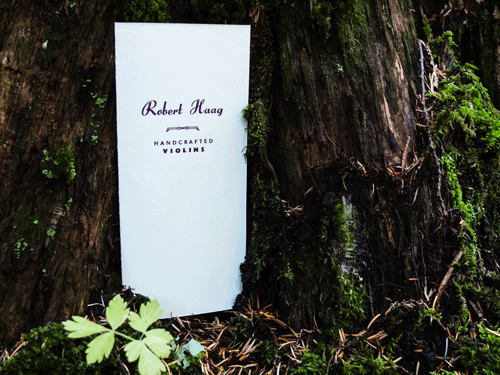
My main approach has been to return to the printing press to create a form that identifies the instrument using letters and ink that relate to the inside label. To generate this form, I returned to mandolin player and full time printer, Michael Hepher, at Clawhammer Letterpress in Fernie, British Columbia. Michael is a very low key, brilliant artist. We were challenged to come up with a design and layout that did not exhaust his supply of letters. While he has many drawers full of "old school" lead letters, he only has a couple of drawers containing the font used on my labels. We ended up using a combination of fonts that worked very well together. In retrospect, this was probably more successful than if we had used a single font. The look is both snappy and vintage.
Michael recommended a heavy, 100% cotton stock that allows the letters to be set deep into the material without showing through. It has a very luxurious feel and contrasts well with the dark (but not black) ink.
The document describes the instrument in terms of dimensions and materials used. There is a section for remarks, and another panel describes the warranty.
Outstanding tone, responsiveness and quality of construction will always be the hallmarks that I strive to achieve in my instruments. It is exciting to achieve a similar standard in an item related to my craft. Many thanks to Michael for going the extra distance. More on Michael and Clawhammer can be found here: http://clawhammer.ca/
Contemporary makers still use labels, often generated on an inkjet printer, but they have also resorted to embedding micro chips in their work, branding interior parts, and creating certificates complete with signed photographs of their instruments, sometimes complete with wax seals.
My main approach has been to return to the printing press to create a form that identifies the instrument using letters and ink that relate to the inside label. To generate this form, I returned to mandolin player and full time printer, Michael Hepher, at Clawhammer Letterpress in Fernie, British Columbia. Michael is a very low key, brilliant artist. We were challenged to come up with a design and layout that did not exhaust his supply of letters. While he has many drawers full of "old school" lead letters, he only has a couple of drawers containing the font used on my labels. We ended up using a combination of fonts that worked very well together. In retrospect, this was probably more successful than if we had used a single font. The look is both snappy and vintage.
Michael recommended a heavy, 100% cotton stock that allows the letters to be set deep into the material without showing through. It has a very luxurious feel and contrasts well with the dark (but not black) ink.
The document describes the instrument in terms of dimensions and materials used. There is a section for remarks, and another panel describes the warranty.
Outstanding tone, responsiveness and quality of construction will always be the hallmarks that I strive to achieve in my instruments. It is exciting to achieve a similar standard in an item related to my craft. Many thanks to Michael for going the extra distance. More on Michael and Clawhammer can be found here: http://clawhammer.ca/
 RSS Feed